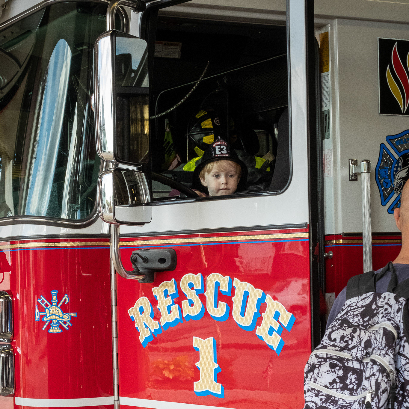
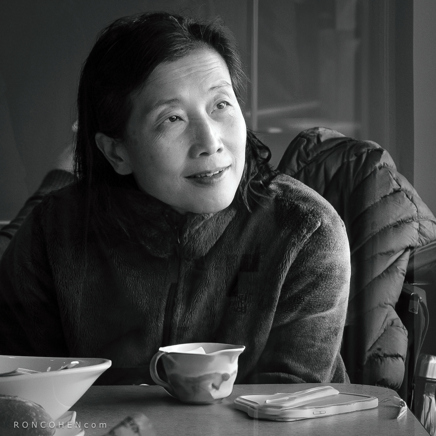
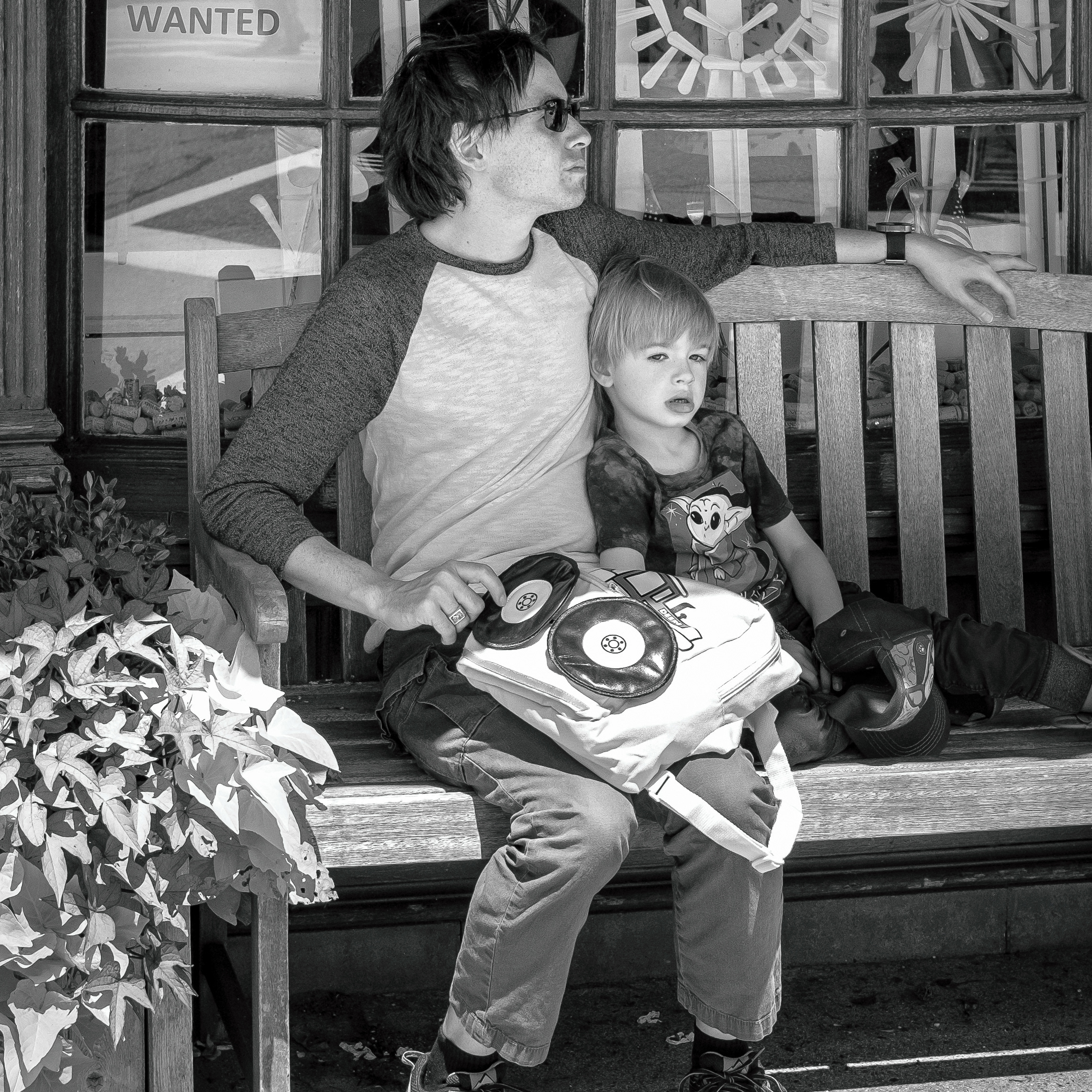
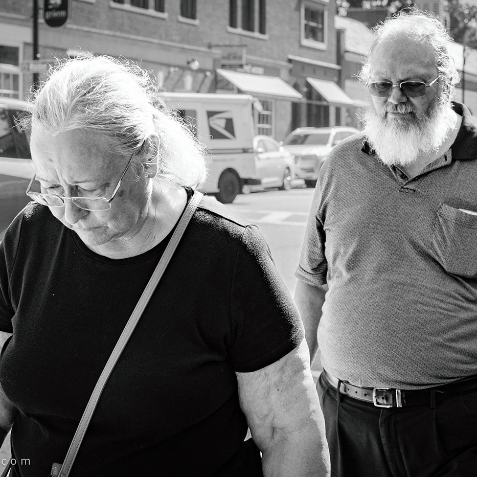
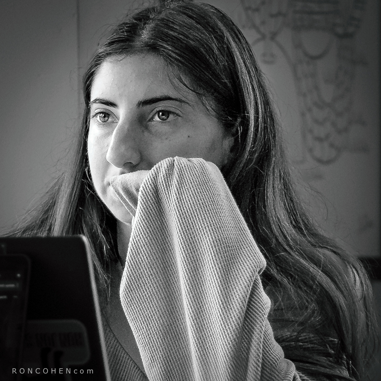
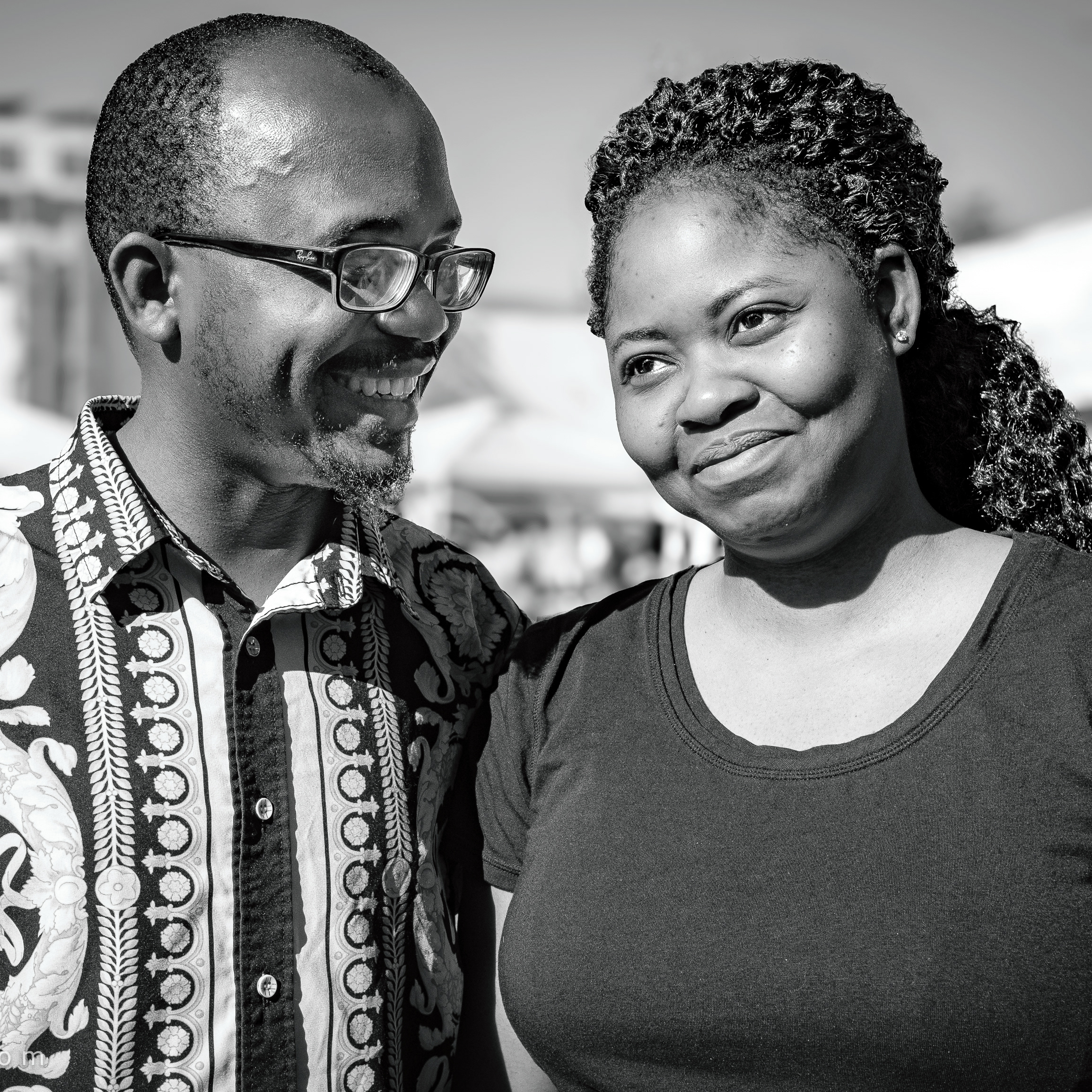
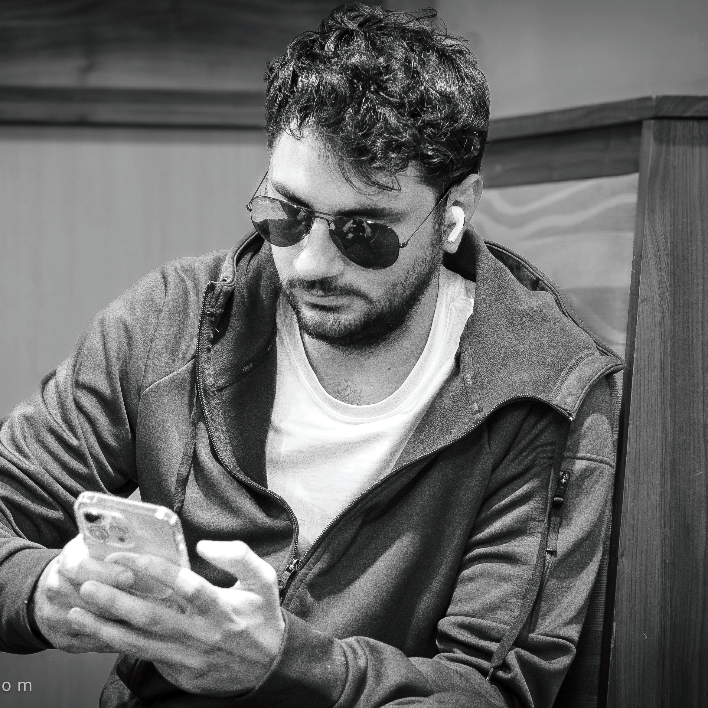
⬇︎Click on photograph to view it full-screen.
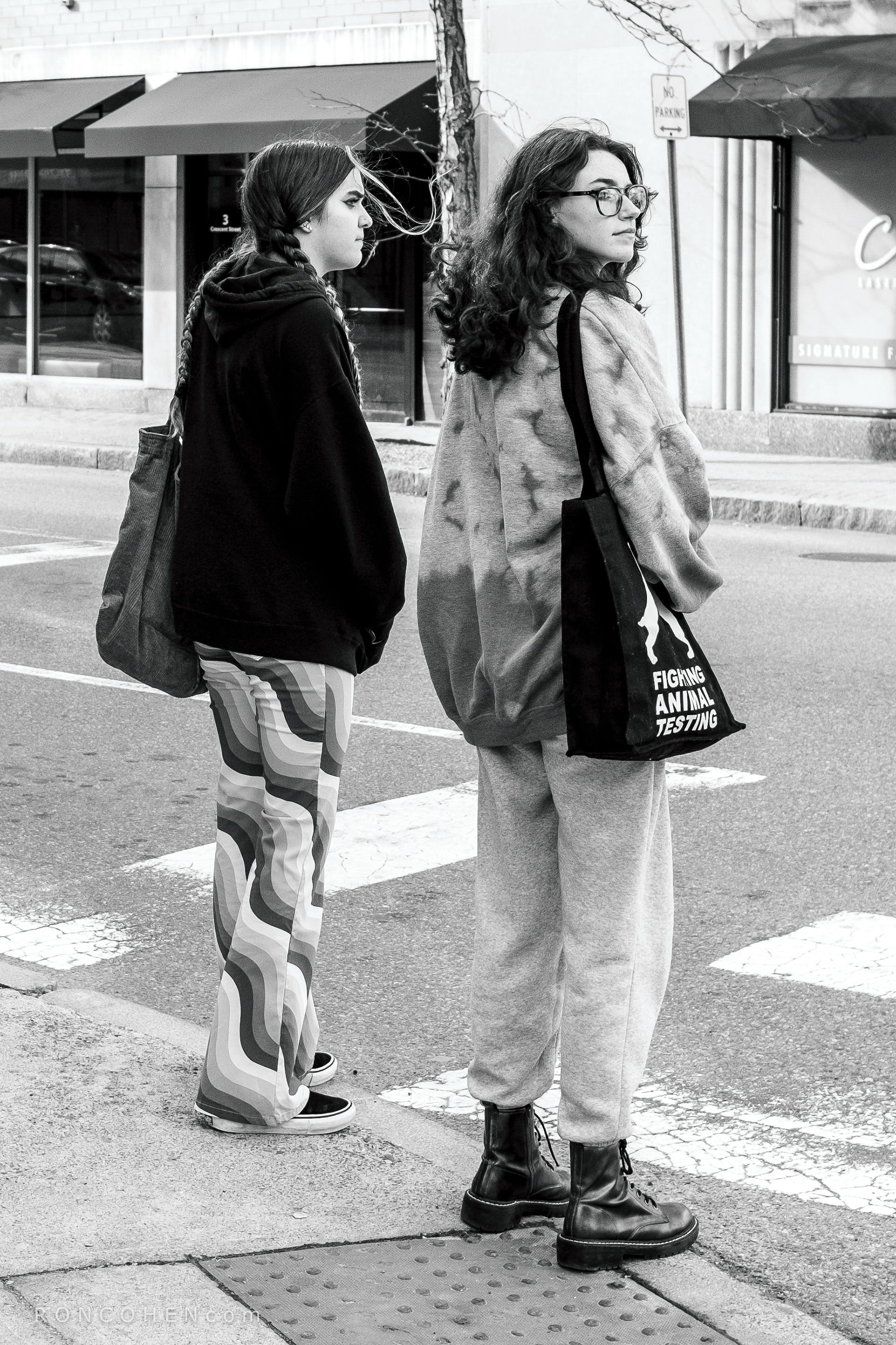
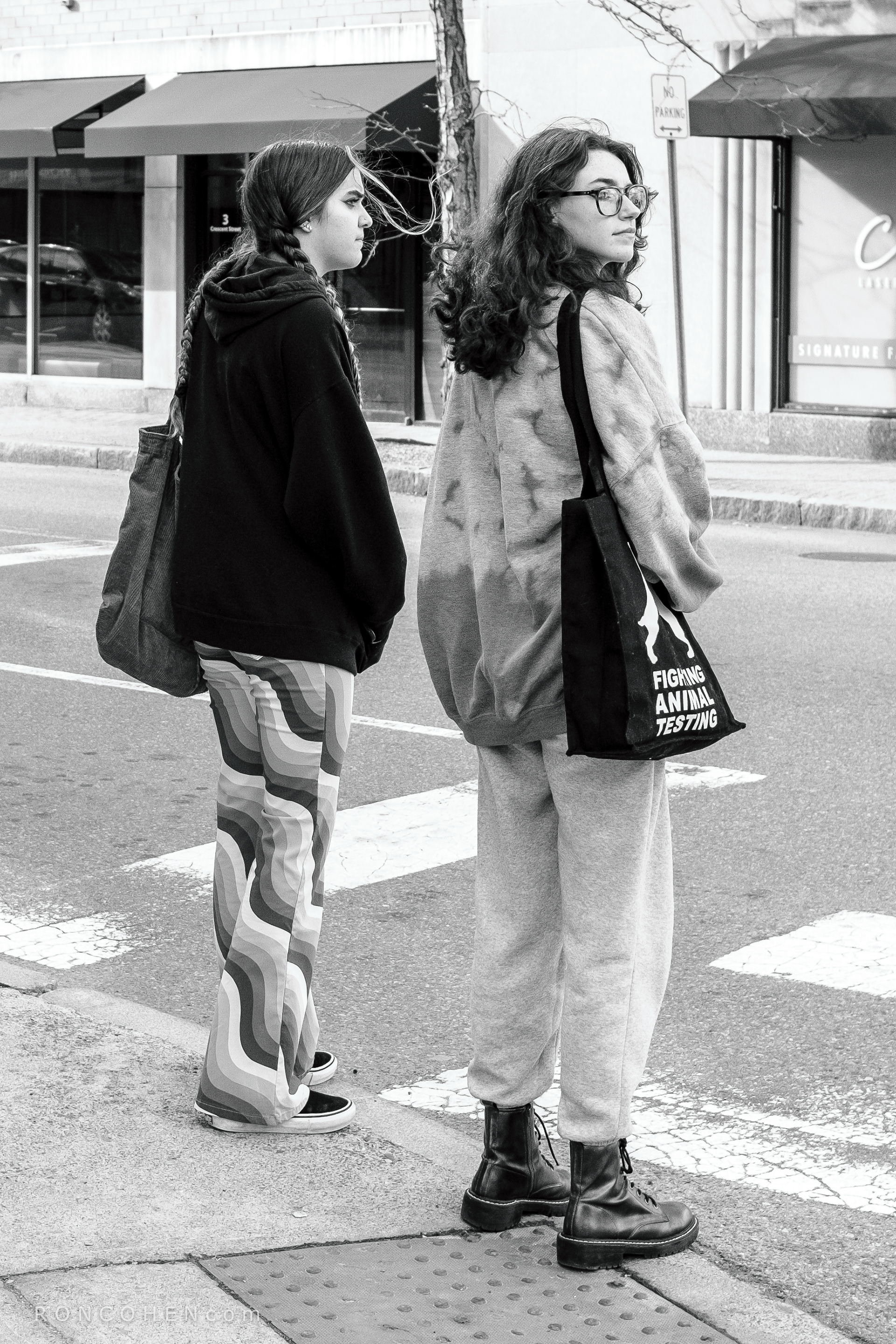
Left, custom profile known for darker blacks, brighter whites and fine details. Right, camera’s default profile.
When we take a photo with a digital camera, it captures data, lots of it. Within the camera a "processor" instantly converts that data into an image. But it's a one-size-fits-all conversion. When a photographer imports the image from the camera into photo-editing software on a computer, he or she can improve the image, often dramatically, by adjusting for the nature of the subject and the lighting under which it was photographed.
For black-and-white photographers, the goal is to achieve a sparkling image—a challenge first posed by the great landscape photographer, Ansel Adams. To that end, he advocated a long tonal range all the way from pure black to pure white.
The image on the left started life in my camera with a custom black-and-white "profile" known for darker blacks, brighter whites and sharper details. For the purpose of this comparison, I converted that original (left) image to the camera’s default profile, that is, its standard method of processing black-and-white images. I did that in my photo editor. The result you can see on the right.
Admittedly, the differences are slight, and may not be immediately apparent to the casual observer. But they are just enough to give the original (left) image some added impact without making it look over-processed (which is a recurring danger in photo-editing). That added impact falls mainly on the subjects, helping to separate them from the background, thereby imparting a three-dimensional effect to the image. In photographers’ jargon, it makes the subjects "pop."
To see the differences in broader context, I invite you to compare two recent projects, Moody XLIII (punchier, to compensate for the gloom of the day) and Veterans’ Day (camera default or standard profile, to capture the dreamy light of that day.) These projects are best viewed in daylight. I hope this little lesson has been helpful. Thank you for your interest.
